Ghana Organics
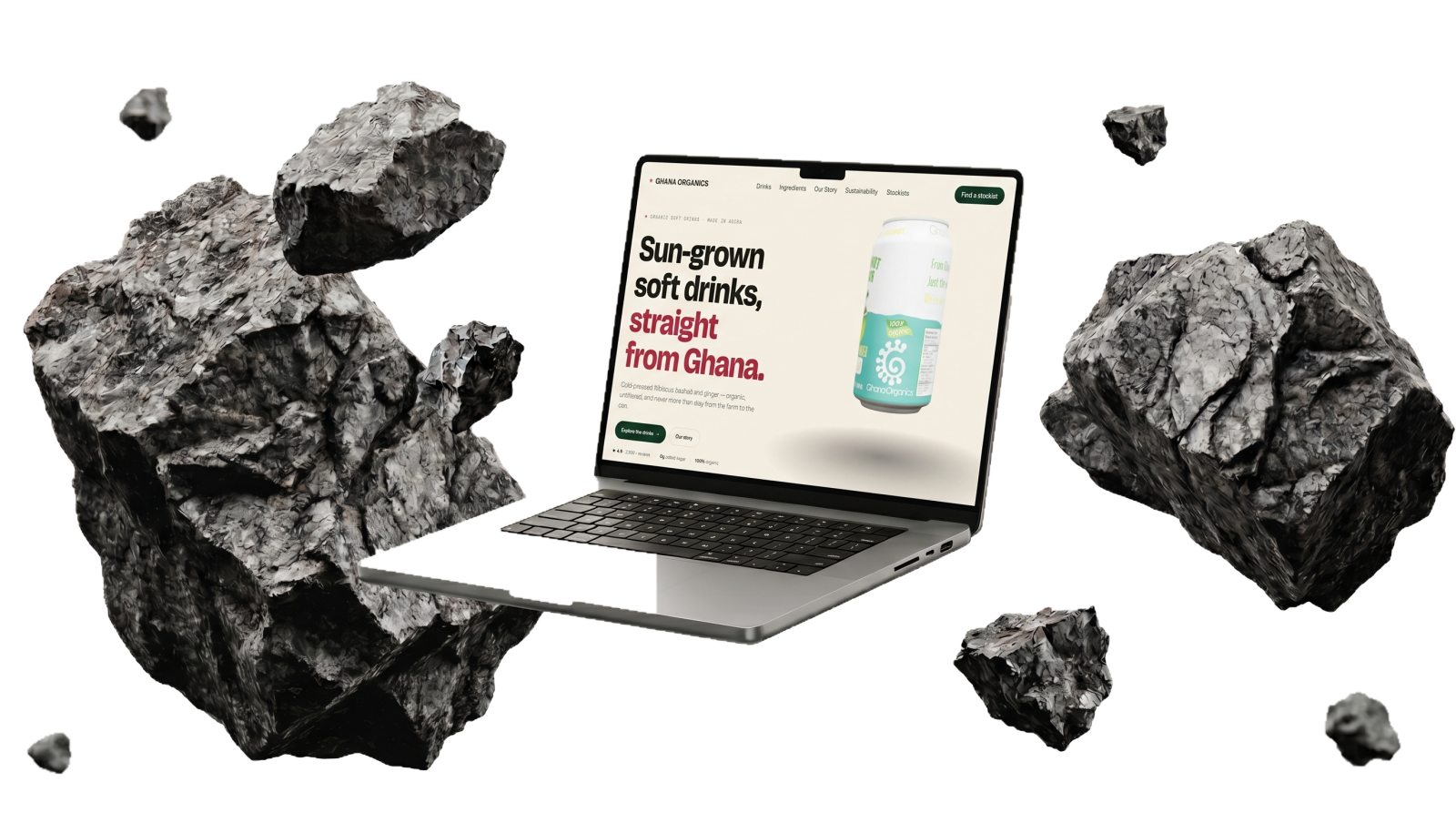
Sun-grown soft drinks, straight from Ghana — cold-pressed hibiscus, baobab and ginger.
DTC brand + storefront
The client reaches out…
A direct-to-consumer brand making cold-pressed organic soft drinks — hibiscus, baobab and ginger.
Ghana Organics had a genuinely premium product — cold-pressed, organic soft drinks made in Accra — and a great origin story, but nothing online that made it look as special as it tastes, and no clean way to actually sell it.
We gave the brand a cinematic direct-to-consumer home: a slow, deliberate product hero, the origin story told as you scroll, and a storefront so the can is one tap from the cart.
We treated a humble drink like a luxury launch — restraint, space, and one beautiful can doing the talking. The result makes an everyday soft drink feel sun-grown, organic and unmistakably Ghanaian.
A strong product deserves confident, quiet design — the restraint is the brand. That product-first art direction now shapes how we launch every DTC brand, Sweet Heaven included.
Want results like this for your business?
Start a projectThe client reaches out…
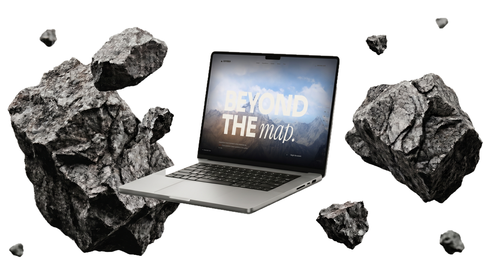
An experiential travel brand that sells the pull of the journey, not just the booking.
Travel sites all look the same — a grid of photos and a booking form. Odyessa wanted people to feel the pull of the mountain before they ever saw a price.
We built a scroll-driven cinematic experience: full-bleed footage, typography that moves with you, and a single confident call to action — begin the ascent.
We built the homepage like a film opening — restraint, motion, and a horizon that keeps receding. It sells the feeling first; the details come after the visitor is already hooked.
Emotion converts before information does — lead with the feeling, then the facts. We now open experiential builds with a single cinematic moment instead of a feature list.
Want results like this for your business?
Start a projectThe client reaches out…
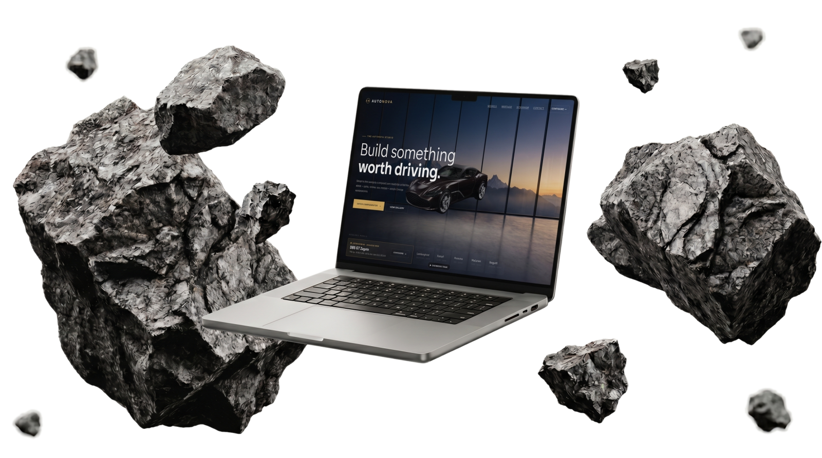
A maker of six-figure performance cars, sold on engineering and emotion.
Selling a six-figure car online means the website has to feel as engineered as the machine. Auto Nova needed more than a photo gallery — buyers at that level expect to configure, not just browse.
We built a real-time configurator: change colour and finish and watch the car — and the price — update live, wrapped in a dark, premium interface that makes every interaction feel weighted.
Every interaction had to feel precise and deliberate. We tuned the configurator so the car responds instantly — the kind of polish that makes a $2M price tag feel inevitable rather than shocking.
Interactivity sells premium — when a buyer builds it themselves, they’ve already bought it. That configurator pattern now informs how we approach any high-consideration product.
Want results like this for your business?
Start a projectThe client reaches out…
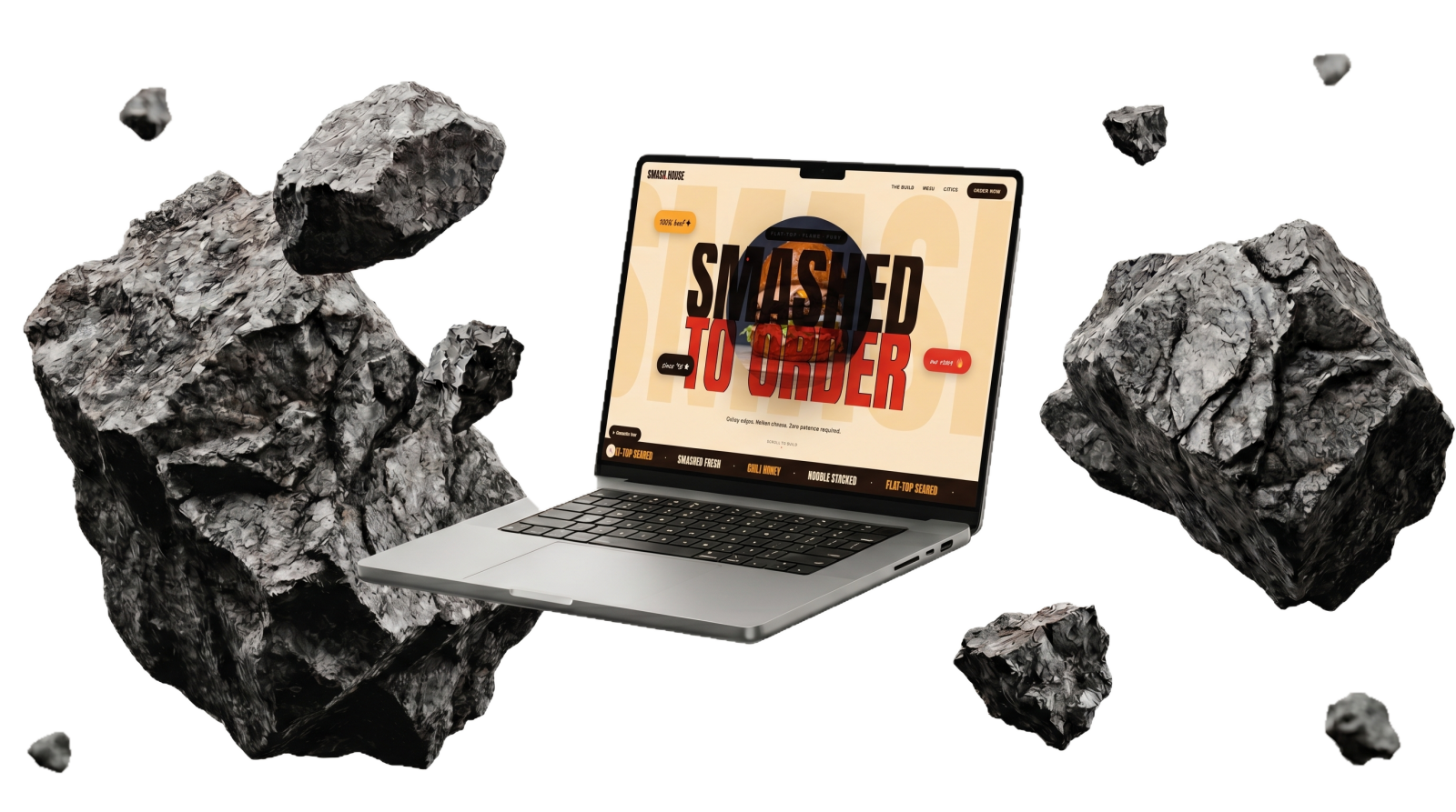
A smash-burger joint with a cult following — fast, loud, made to order.
Smash House had the food and the following but no home of their own — just a third-party ordering page and an Instagram bio link. Nothing told the brand story, and every order paid a marketplace its cut.
We designed and built a complete brand site end-to-end: a characterful, animated storefront engineered for speed first, with the menu and ordering front-and-centre and a structure search engines and AI assistants can read.
We started with the swagger of the brand, then refused to trade it for weight — every animation budgeted against load time, every image served at the size the device actually needed. Launch went live with no downtime and no broken orders.
Personality and performance are not a trade-off — you budget for both from the first frame. Every build since runs against a speed budget set on day one.
Want results like this for your business?
Start a projectThe client reaches out…
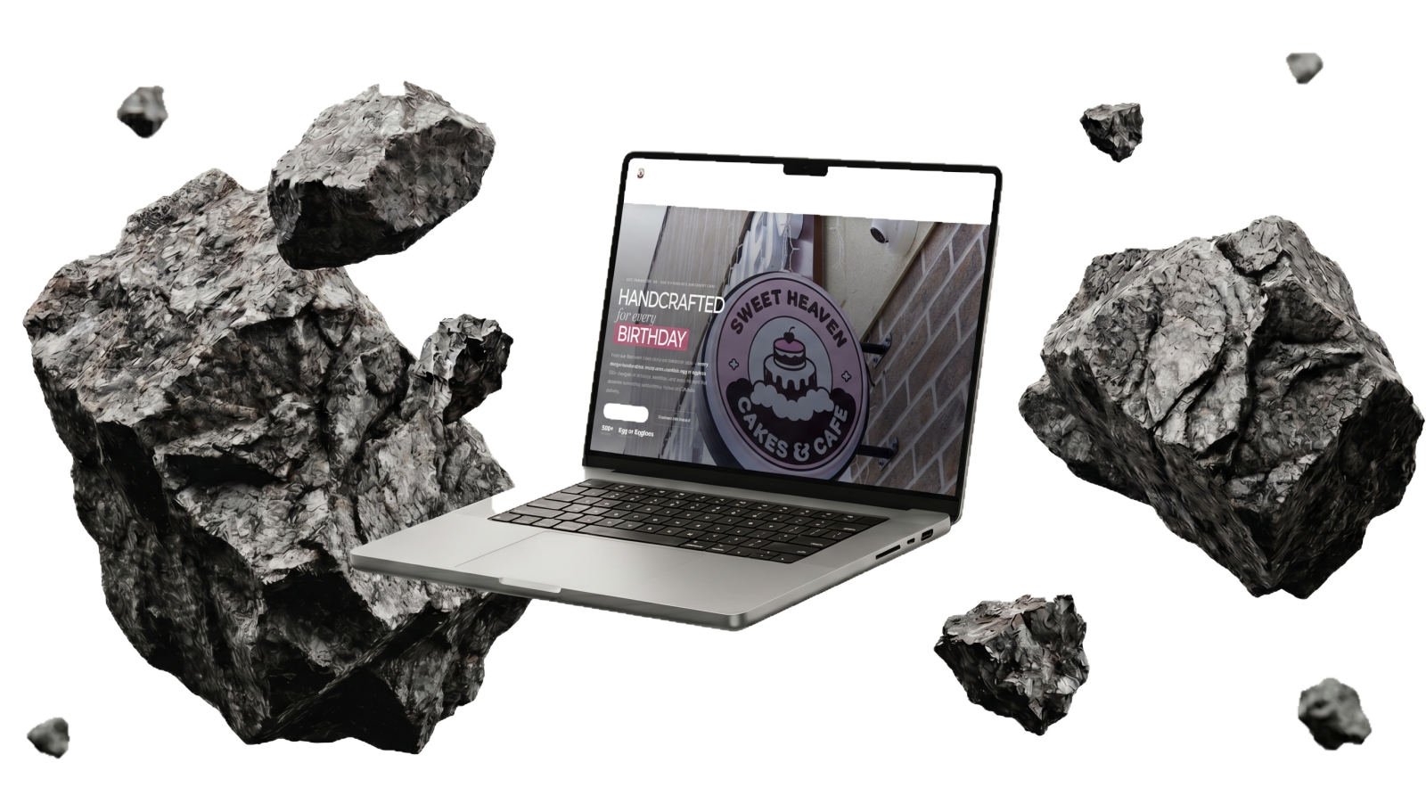
A bakery and café handcrafting custom cakes for every celebration.
Brampton is wall-to-wall bakeries. Sweet Heaven made some of the best custom cakes in the city but sat below weaker competitors in search, while a leaky store turned just 0.48% of visits into cart-adds.
We fixed both ends: competitive intel to find the search gaps rivals left open, plus a clean Shopify storefront — migrating ~937 product codes across 8 categories without losing a sale or a ranking.
Instead of fighting head-on for the most contested keyword, we claimed the gaps competitors were thin on, then re-platformed the store like an engineering job — export, map, verify on staging, flip once proven. Customers never saw a seam.
Win the gaps before the giants, and treat a migration as a data-integrity job, not a redesign. That gap-first, prove-on-staging discipline now protects every store we touch.
Want results like this for your business?
Start a projectThe client reaches out…
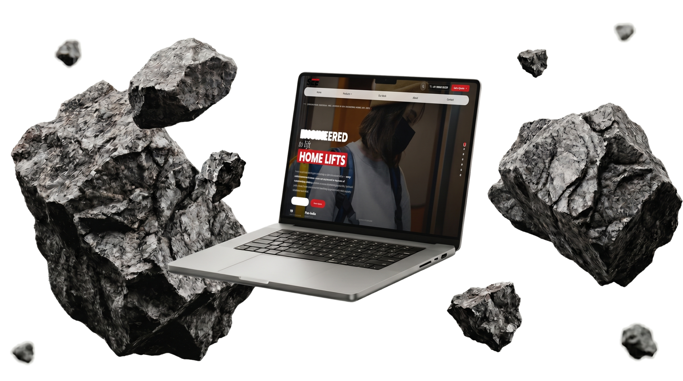
An engineering firm building elevators and industrial systems, with 19 years of credibility.
Elevators and industrial parts are not a category anyone calls beautiful. Shiv Engineering had 19 years of credibility and in-house fabrication, but the brand and site looked like a spec sheet — and there was no budget for a product photo studio.
We rebuilt the brand as SEE — a full identity, a 20-page product catalog, AI-generated studio-grade product photography, and a dark, premium website that leads with the engineering heritage.
The brief was trust: a buyer should land on the site and feel they are dealing with a serious company. We treated every screen like a premium product page — clean system, real hierarchy, photography that looks commissioned. It reads as a brand three times its size.
Any business can look premium — the system and the photography do the work, not the budget. AI product photography is now a standard option we offer industrial and e-commerce clients alike.
Want results like this for your business?
Start a project